 |
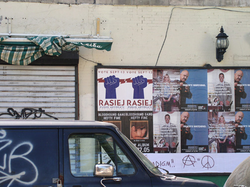
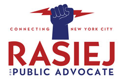
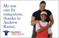
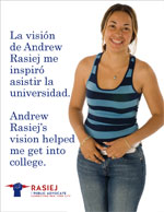
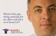
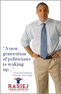
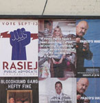
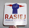
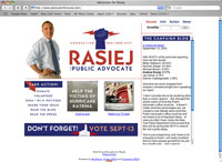
In 2005, I found myself working on a New York City Public Advocate campaign, ostensibly as the volunteer coordinator. The campaign, however, had a number of serious issues, including no coherent expression of its message, and no efficient strategy for reaching the voters they needed to reach. Within days (things in politic campaigns happen incredibly quickly, or not at all), I had taken on two additional responsibilities: field (voter outreach) operations for Manhattan, and creation of marketing materials and graphic image. The resulting promotional effort was as unconventional as the candidate, and owed more to the advertising style of tech companies than that of political candidates. Using better-than-average photography, a casual, witty writing style, and a number of "guerrilla" marketing efforts, I presented a campaign that was harder to ignore.
Simultaneously, I was generating a map of likely voters so that field workers could spend their time in those areas with the greatest densities of people we wanted to reach. (We didn't have the option of mail.) I created a huge map which matched densities of voters with nearest subway stops, and were able to strategize outreach accordingly.
The campaign did not, ultimately, do very well. But, as with many political campaigns, there are too many factors to determine why. I do know, however, that the promotional work got attention far beyond the campaign, and my geographic analysis of voters presented the campaign with a great deal of data which contradicted conventional wisdom. I think I'm proudest of that: using careful and creative analysis to create a more efficient and more effective process which defies expectations and can change people's thinking.
|
 |  |  |
 |  |   |
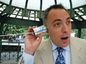 |  | 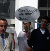 |
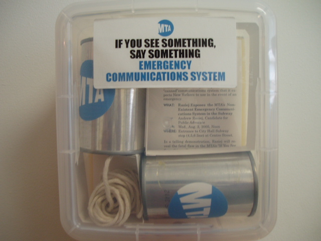
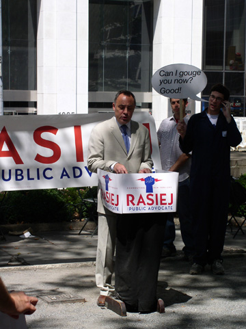
While most of the above were conventional lit pieces, some need more explanation. The middle row, right side, is a paddle fan, popular among the elderly in the hot urban summer. In the lower left corner is the press release for a "stunt", announcing a proposal to increase subway security and pointing out the antiquated communications system. The event in the lower right drew attention to the telecom monopolies; it was held across the street from Verizon's headquarters and featured interns dressed up like the Verizon "Can you hear me now?" guy, holding signs designed like cartoon balloons. I conceptualized and designed all the visuals, including the costuming...
|
|
|